Branding
HARP
From shelter to home. A new identity for HARP, Southend's homelessness charity.
01. HARP
HARP is a homelessness charity based in Southend-on-Sea, working every day to end homelessness. Their support covers the whole journey, from emergency accommodation and day-to-day help through supported housing to moving into a home of their own.
We worked with HARP to build an identity that reflects that care: warm and human, but serious about the work.
It started with an in-depth workshop with the HARP team, getting under the skin of what they do and how they want to be seen.
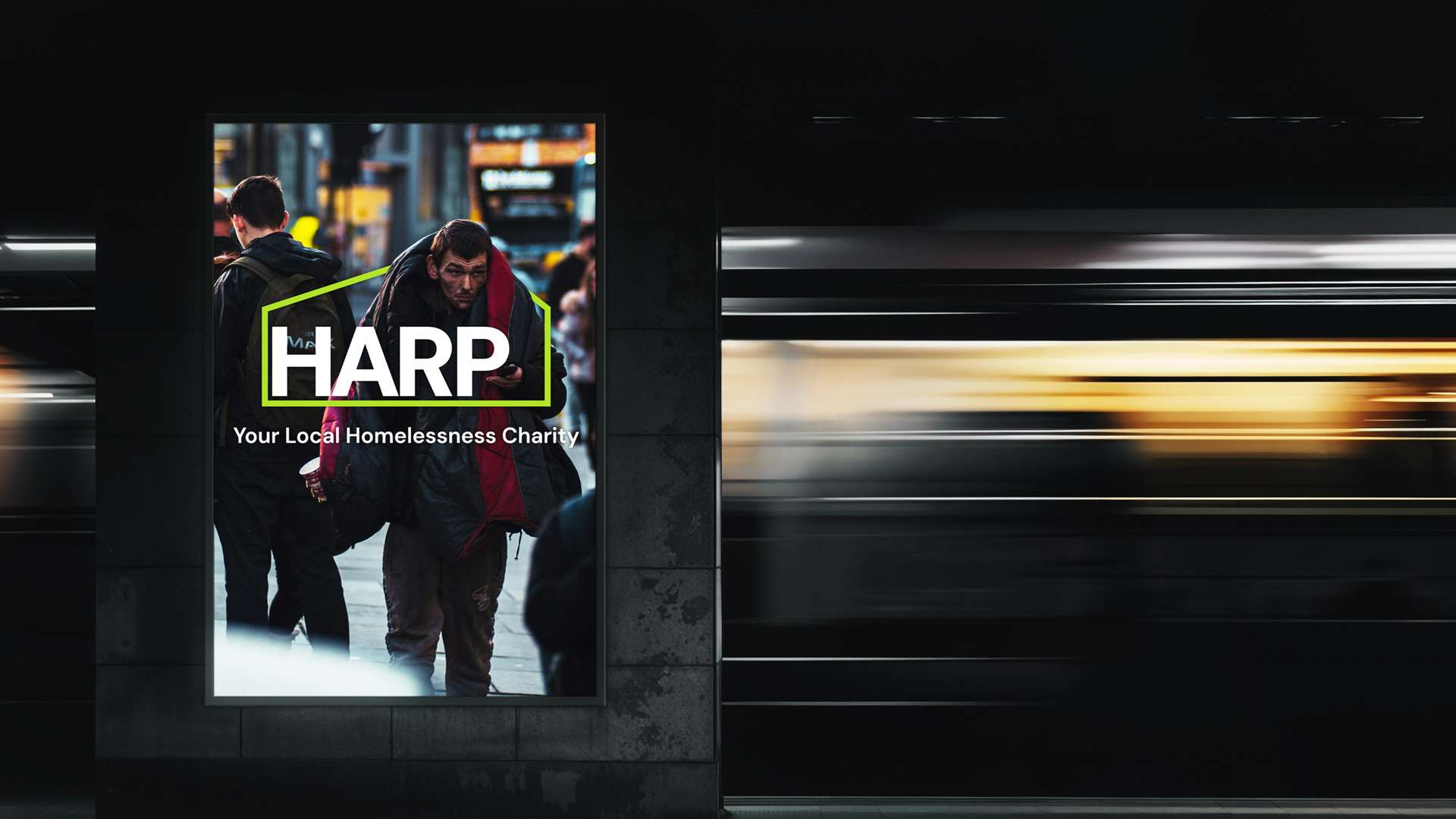
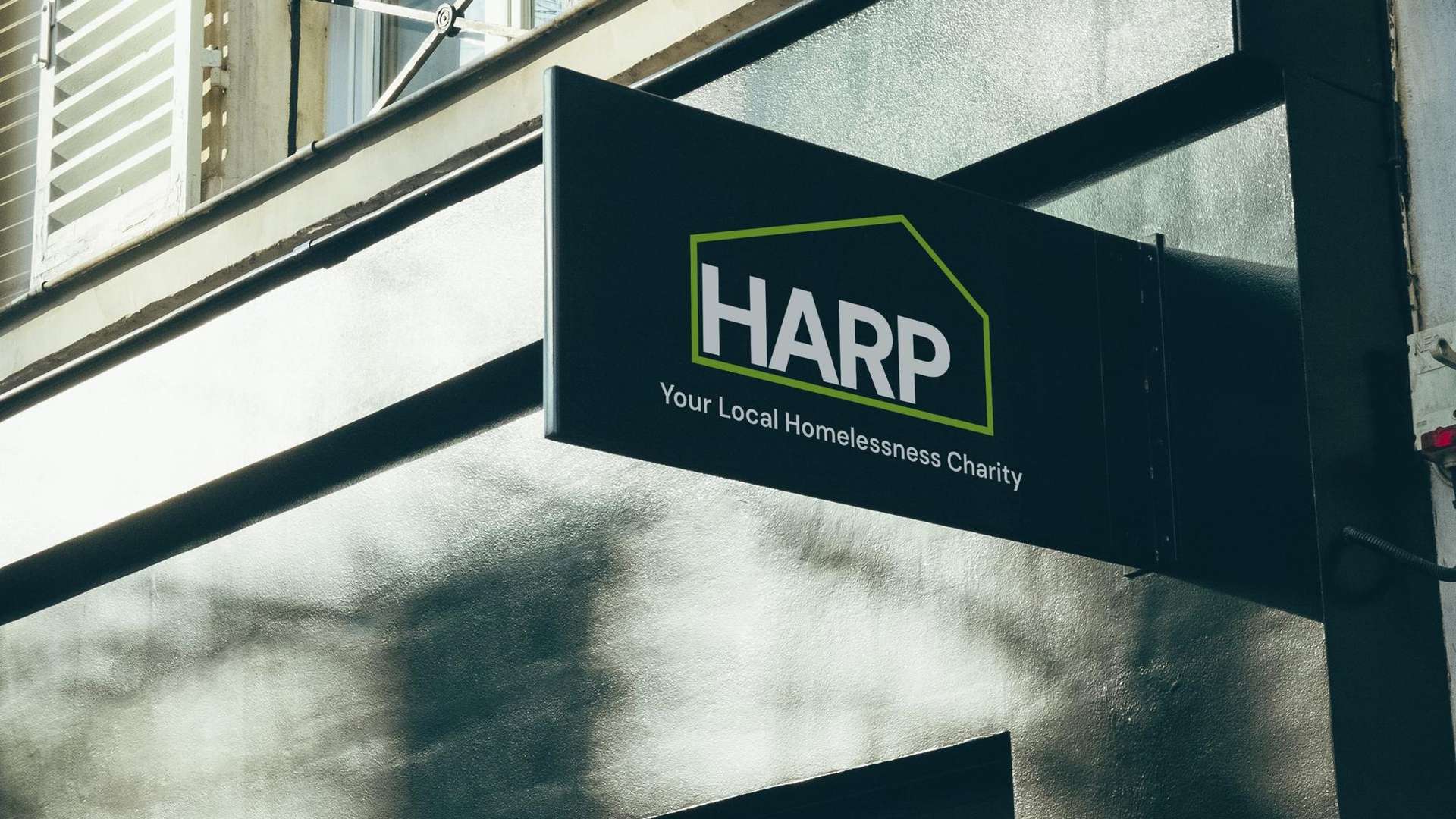
HARP’s original logo showed a roof above their name. We kept that idea but took it further, extending the roof into a full house shape that surrounds the wordmark. This shifts what the logo communicates, from a sense of shelter to a more complete picture of the 360° home and ongoing support that HARP offers.
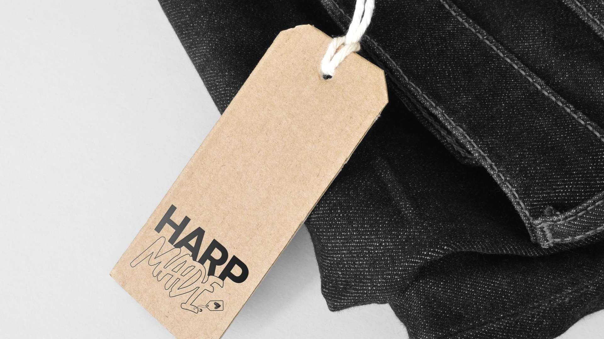
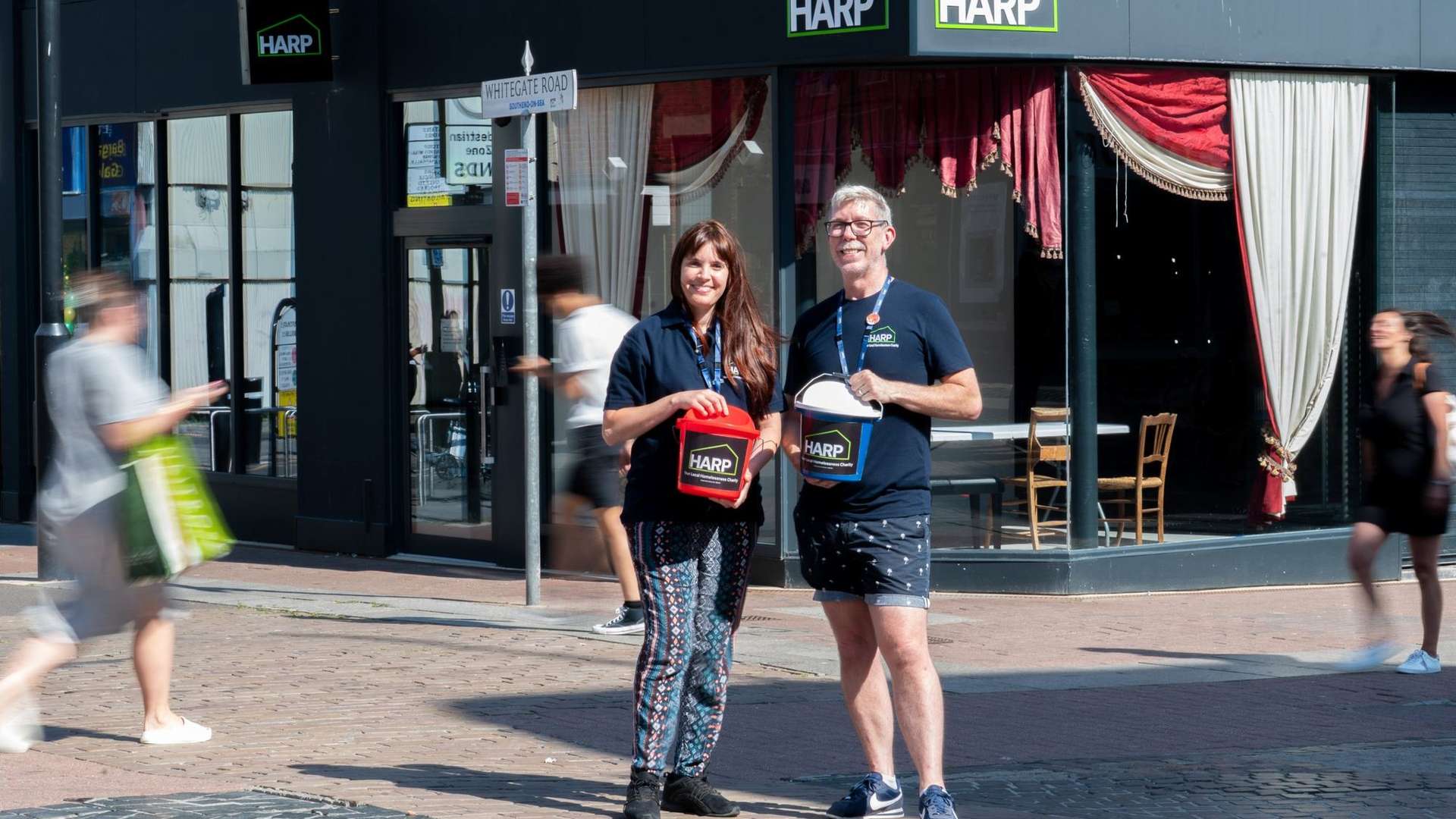
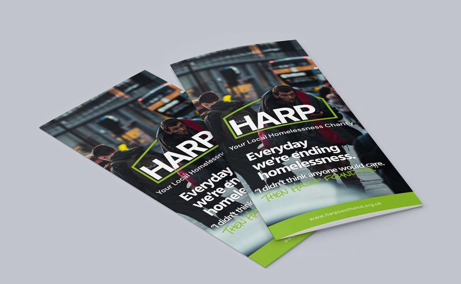
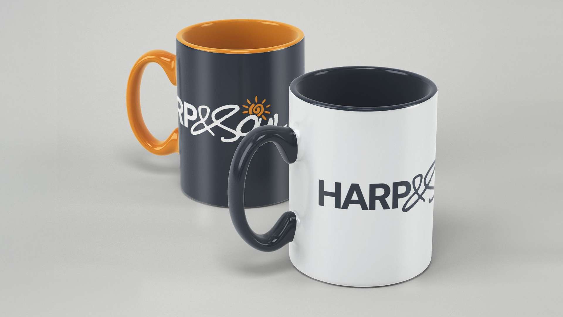
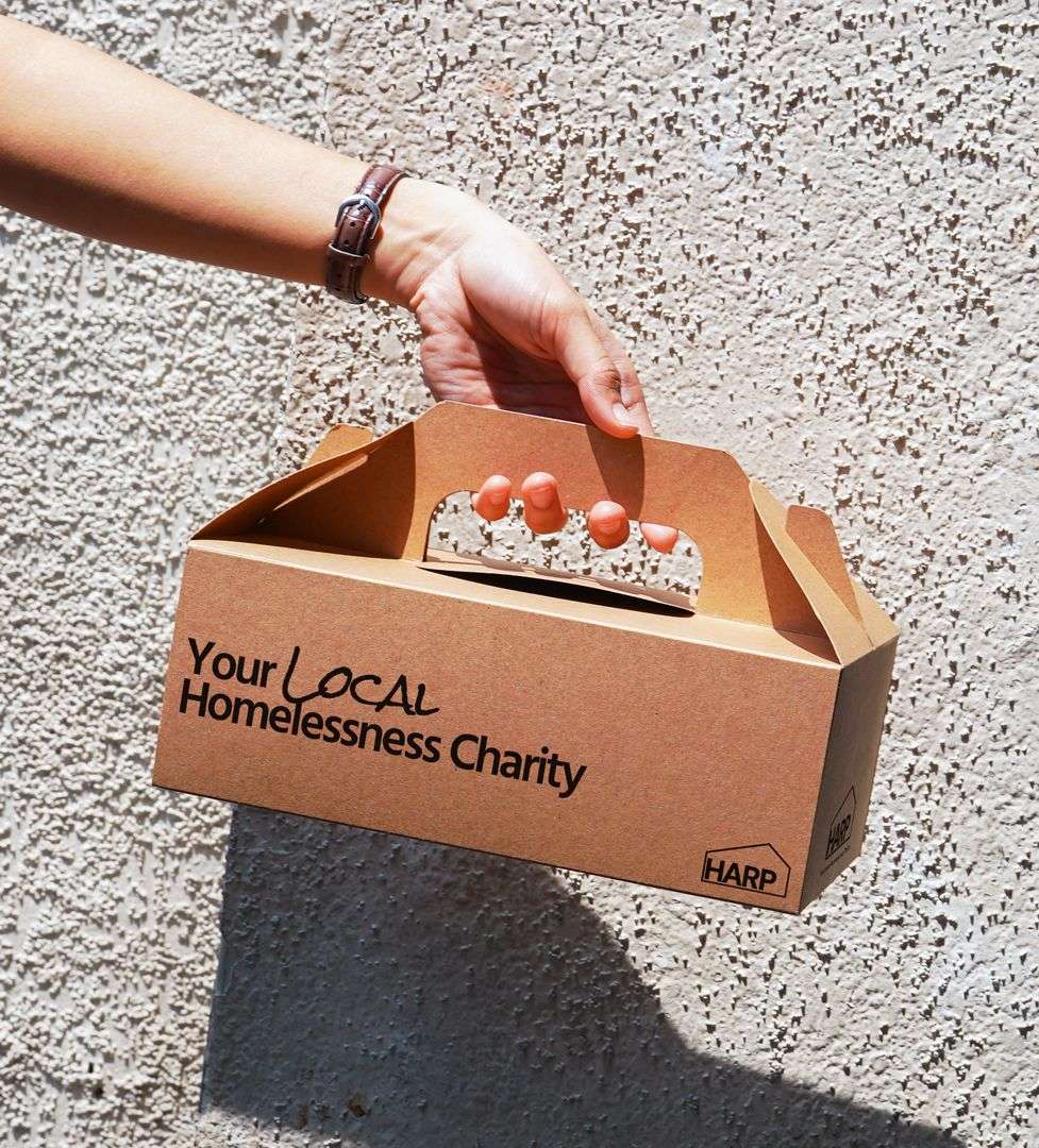
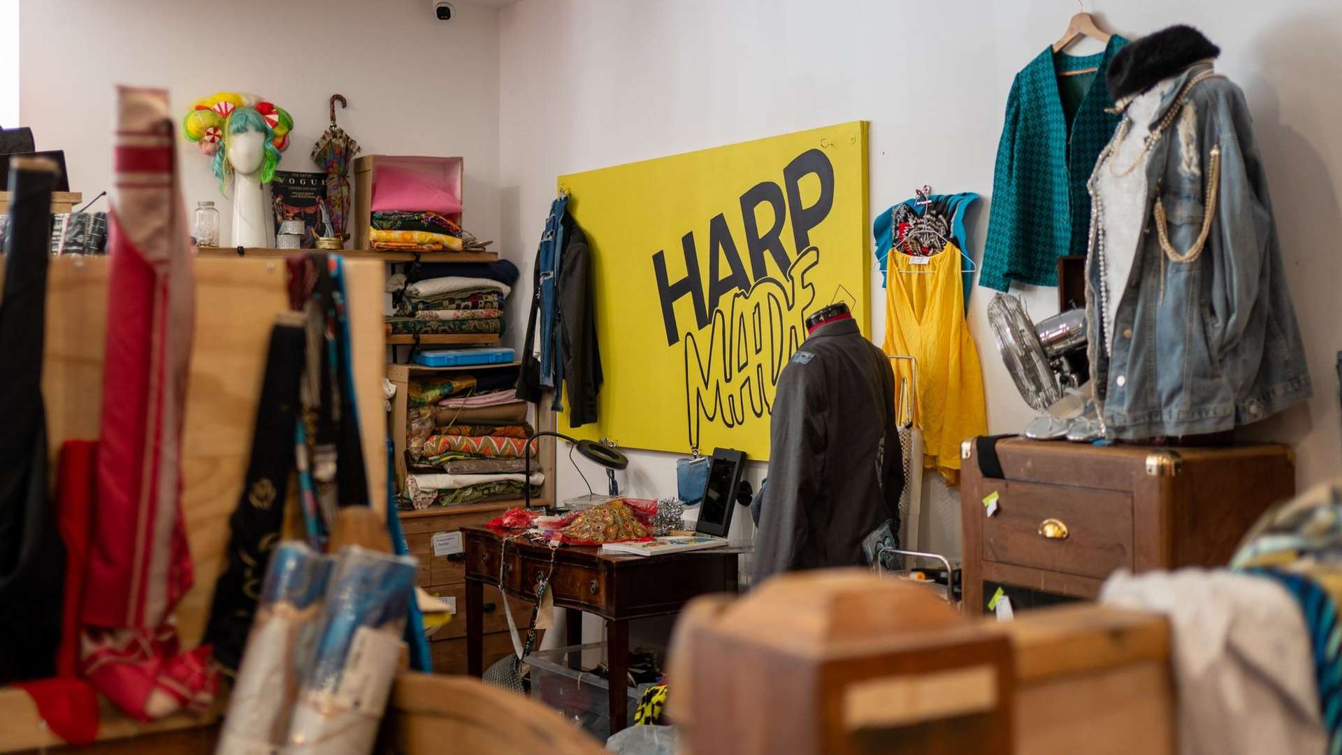
From there we rolled the identity out across the charity: signage, posters, leaflets, packaging and merchandise, plus the HARPMade and HARP & Soul sub-brands. We also worked with HARP's shops across Southend-on-Sea, Leigh-on-Sea and Westcliff-on-Sea on how to bring the brand into each one consistently, so it feels like one HARP wherever people come across it.
Get in touch now



Trusted by