Visual Identity
Cybernet
CyberNet partnered with Rev.01 to develop a new visual identity that reflects the flow and complexity of modern digital infrastructure. The project focused on creating a brand that communicates technical expertise while remaining accessible and human.
01. Cybernet
CyberNet operates in a highly technical sector where services are often complex to explain. Rev.01 developed a visual identity that reflects the movement and connectivity of modern digital infrastructure while keeping the brand clear and approachable for the businesses that rely on it.
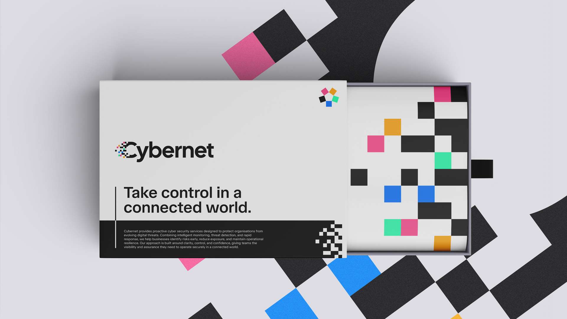
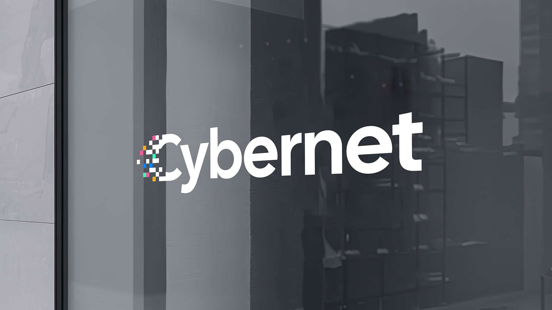
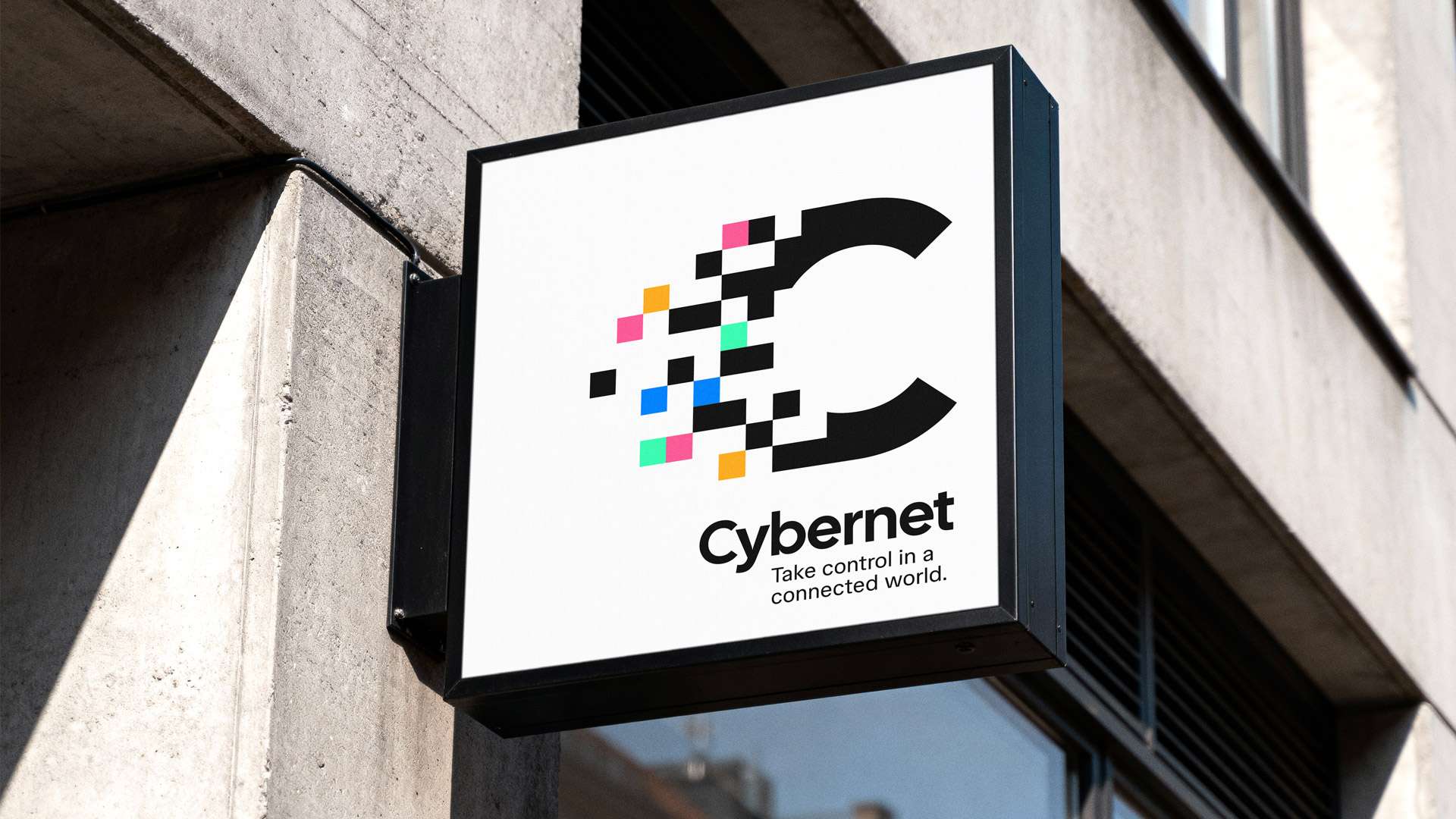
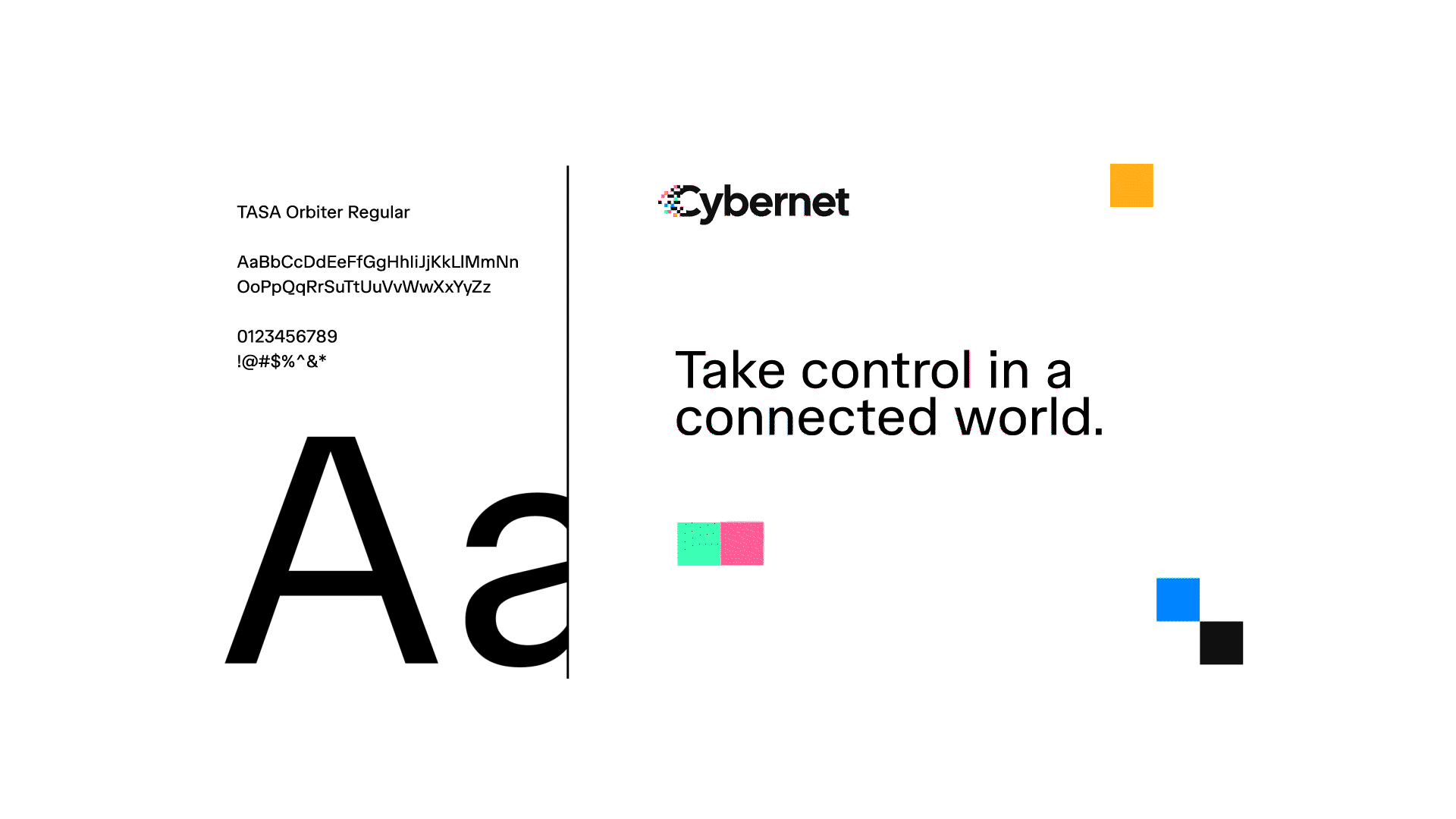
The identity centres around a distinctive symbol built from a structured letterform. A strong, anchored “C” forms the core of the mark, representing stability, reliability and the secure foundation of CyberNet’s services.
From this structure, fragments break away to represent the movement of information through connected systems. These elements visualise the constant flow of data across networks, reflecting the digital environments CyberNet helps businesses manage and secure.
Rather than presenting cyber security as something static or defensive, the mark suggests motion and activity. This approach reflects the reality of modern infrastructure, where systems are continuously evolving and data moves constantly between devices, networks and cloud platforms.
Colour was introduced deliberately to bring warmth and accessibility to a subject that is often perceived as purely technical. Cyber security branding frequently leans into dark palettes and aggressive visual cues. By introducing colour into the identity, the brand feels more approachable while maintaining the credibility expected from a technical service provider.
The resulting identity balances structure with movement, reflecting both the stability clients expect from a cyber security partner and the fluid, interconnected nature of the systems they protect.
Get in touch now


Trusted by